Showing posts with label budget. Show all posts

Thursday, November 14, 2013

Brightening a dark living room on a budget!

The materials cost for my clients living room, kitchen, dining room and entryway came in at right around $300. With hard work, paint and careful shopping, I can change your homes look and feel, even on a tight budget!

Painting the walls Benjamin Moore Barely Beige 1066 really lightened the room. This color is a true beige neutral, but carefully chosen for its gold undertone. You can never just grab a white or beige off the paint shelf! They ALWAYS have an impact, because a gray or cool neutral will make the walls feel dirty and the room, cold.

Other changes: Spray painting the family frames white and arranging them in a grid. Swapping the white kitchen armoire for the heavy cherry one. Painting a long low dresser white (another clever Craigslist find!) and using it as the new TV credenza.

BEFORE:
 
 Notice how much better the deep red sofa looks with this wall color? It's because they share the same undertone! The beige wall is warm and so is the red couch, where the previous green is on the colder, blue side and was clashing. Usually, if a room feels "off" and you can't tell why? Look at the undertones and you will see the colors are quietly fighting each other.
 
AFTER:
Living rooms that have a main walkway right through the middle of them are very difficult to arrange furniture in. This is a common problem, and I am left to wonder just how architects think through their layouts?! Design rules such as "Never line your furniture up along the walls" must be thrown out, and practicality made the newer, more useful, rule.
 
There weren't many options, so I merely switched the sofa to the longer wall, and put the love seat up against the window, making a bit more room for the side chair. The most critical design decision: all of the men in the family are "gamers" and having the same issue at my house I knew this--TV placement was critically important!
 
God blessed immensely (I truly believe this client is one of His favorite kids!) and I found heavy velvet drapes, in a perfect golden wheat color, to hang on the large picture window. From Restoration Hardware, these retail for $269 each, but at the thrift store in perfect condition they were just $19.99 each.
 
She loves them because they add a touch of luxury and could easily be hanging in an English library. He loves them because they block sunlight, making movies and Xbox easy to see, any time of day.
Another amazing find was this area rug:
 
Even though the plans are to eventually replace the upholstered furniture, it was bothering me as we were finishing the project, that the deep red couches didn't "quite" blend with the beige and white tones of the room. Then I found this large rug with a pattern which couldn't be any better: the same bark red of the couches, with the brown of the new chair and the gold of the curtains, with just a touch of ocean blue!? It was EXACTLY what was needed to tie the entire design together!
 
$20 at the Goodwill, solid wool and with the price ticket still on the back, we saved around $200! Her youngest son didn't care about the colors or the perfect pattern, he just immediately threw himself upon it and yelled happily "Yay! A soft rug! Now the room is perfect!" I quite agree, though when I bought it I admit, I wasn't thinking of how 13 year old boys watch TV, but he IS right. For both his reasons and mine, this rug is perfect!
 
An example of how I coordinated the room colors, this is the wall entering the kitchen:

And looking into the living room, from the kitchen:


This is the hallway, just off the main entrance, before:


AFTER:
 
The fireplace wall has a birdcage on one side, a piano on the other and neither could be moved, but I still managed to change things up! I replaced the purple chair (covered in the striped blanket) with a soft brown chair and ottoman, found at a yard sale for only $50. Rearranging items, adding in old books, soft lighting and lots of texture via baskets, plus a few throw pillows in light colors was all this side needed!
 
The oil painting on the mantel in the "after" was the rooms inspiration piece. Taking cues from its setting, I added just enough accessories to add that beachy coastal feel, careful not to overdose on lighthouses and shells. You have to be careful with a themed room! A theme can bring direction and cohesiveness to the party, but then quickly turn overdone and kitschy on you. As with all creative endeavors...editing is the hardest part.

Before:
 
After:

When decorating, remember:

Make sure adjoining rooms flow, especially if you can see them, but even if you cannot.

Use the same undertones for walls and main furniture (choosing either cool or warm...but warm is better!)

Add small lamps to brighten dark corners (2-3 minimum per room, more if it has low ceilings, or is large)

Use themes carefully, editing as needed.

Plan for how the room is actually used, not just for how it looks--checking that everyone can see the TV, the main walkways are clear, there is a lamp for the bookworm, a rug for kids to sprawl on, a throw blanket nearby, etc!

And most of all-add more of what makes YOU feel at "home" For this client it was books, and the beach, and pictures of her children. And life doesn't get much better than those three blessings, does it?

Wednesday, November 13, 2013

A Dining Room and Kitchen Redesign

This job was a large one, but one of the most pleasurable jobs I've had! The client was so trusting of my vision for her space, and so agreeable to the changes I suggested, that working with her was a delight. She, and her teenage children, jumped in and worked hard right alongside me.
With good music and diet Pepsi, we spent a few days together, pushing furniture around, wallpapering, and painting everything that would hold still. We had so much fun in the kitchen/dining room that we tackled the adjoining living room too, and you'll see photos of that lovely area, very soon!
When you hire me for a redesign, the most important aspect of the job is what comes first, way before we buy paint or rearrange furniture. We talk! And it is always my intent to make this part as relaxing and fun for you, as possible. I will ask questions, and look around a little, and "interview" you a bit, simply trying to learn what makes you feel at home, and what your family's needs are, so that I know how best I can serve you.
When this client and I talked about her home and her needs, I learned some very important things:
She adored cobalt blue and collected Platzgraff china. That always worked with the mauve colors in her kitchen, but she was tired of the 90's look, ready to update, yet wondering how?
BEFORE:
She loves the ocean, and the beach has special meaning to her family. (This was key for the living room)
When I asked what her most favorite pieces were, I learned that she had two heirloom paintings that she loved, but were not displayed, because they didn't currently match anything else in her home. I'm a big believer in "if you love it, it can work" and immediately starting thinking about how to incorporate her favorite art into our re-design.
BEFORE:

Most of all? She longed for a fresh start, and to feel refreshed instead of depressed, about her surroundings. They are a busy family with full schedules and so she craved clean, clear spaces without decor overload...just enough to feel pretty, but not so many tchotchkes that the small rooms felt crowded! My take-away? She needed something WARM, but SOOTHING.

My plan:
To keep the blues as accents, but update the space with a somewhat french country, cottage feel. Since her countertops were blue, and we wanted to warm up the space, I did not want to use more blue on the walls, but the white walls were too stark. In order to offset the blues, and keep them as an accent-only color, I suggested we paint the walls a warm apple green. Green is what I call "Gods neutral" because if it weren't so easy on the eyes? Then He wouldn't have put it all over His creation! Taking cues from the original Designer is always a good idea! This color instantly made the room bright and cheerful while still feeling peaceful and calm.

Benjamin Moore 478 Sweet Caroline green

BEFORE:
AFTER:

This part was tedious, and not every homeowner is willing to paint wood, so I was grateful she trusted me when I said we needed to paint ALL of the orange toned wood--the doors, trim and baseboards--with a crisp, bright and glossy white. We did the same in the adjoining rooms. Not only is it an instant update to the space, but it also was key in making her beautiful table and chairs shine. Now they are truly the centerpiece of the dining room!
AFTER (but before her china hutch was added)
The perfect size corner china hutch, found on Craigslist and painted white to tie in with the cabinets and trim:

Next, remove the old brass rod above the sliding glass door and hang a soft fabric valance in shades of green, yellow and blue (tying everything together) to the very top of the ceiling. Whenever possible, hang your window treatments high, as it helps any ceiling seem higher!

Valances aren't nearly as popular as they used to be, and they were overused for so long, it's no wonder we all grew tired of them! Normally I would suggest long curtains on either side of a slider, but as you can see in the photo it's a very small room, with little to no space on either side of the door...especially once we added the hutch. In this instance, a valance was the right design element for the space, drawing the eye up and adding needed pattern to a mostly-solid space, and softness to a room with sleek surfaces.
The biggest change (and the most backbreaking part, for the homeowner!) was removing the pink laminate wainscoting. It had done its job well, protecting the wall and proving easy to clean while her four children grew. But the kids have grown, and we couldn't move on, with that color! So bless her for agreeing with me and tackling the horrid job of prying it all off, then scraping old yellow adhesive off the wall for hours! It was a difficult process but so worth it, in the end.
BEFORE:
Since we were working on a tight budget, I chose to use paintable wallpaper in a bead board pattern, instead of wood, for the new wainscoting. At only $20 a roll (at Lowe's Home Improvement) we could do the whole wall, plus the back of the upper cabinets, for $40! Once capped with trim molding and covered with several coats of primer and high gloss white paint? You have to look very closely to know its not real wood!
This photo also shows how, in order to make more room for the cook in the kitchen, I moved the armoire out to the living room. Instead of that, I hung a large wall cabinet, going all the way to the ceiling. Though it gives her plenty of extra storage, being vertical means that by taking up zero floor space, the room automatically feels more spacious! Painted white and covered with extra bead board wallpaper, it looks right at home in her cottage fresh kitchen. With its makeover, it shows no traces of its former life in a dusty old garage!
BEFORE:

AFTER:

 Finally, adding accents means we do a little math--the only kind of math I enjoy! Subtracting all the country and mauve decor and adding instead, these assorted lovely plates in our blue accent color. Using various patterns and sizes of plates adds interest but still keeps the overall look quiet. Found at thrift stores for less than $2 each, plates are the perfect, inexpensive art for dining areas!

 Well aware that teenage boys are going in and out of this door frequently, we used both decorative hangers AND mounting tape, to firmly secure the delicate pretties!
The sweet little bird plaque I stole out of her bathroom because it was the perfect size to hang up here and cover an unsightly phone jack. The painting of a girl in a field (above, in dining room photo) was one of the two original oil paintings, our inspiration pieces! Now given a place of honor above the dining room table, and the larger one above the fireplace mantel, where they are daily appreciated.


One element that really adds to the redesign is the new faux "tin" backsplash. You can purchase it at Home Depot in various patterns and finishes, and even a novice like me can install it! In an evening, with caulk as the adhesive, and using paper bags to make a template, the sturdy plastic material is easily cut to fit with heavy duty scissors...and the material is very sturdy and washable, to boot! The homeowners were thrilled with how the kitchen was so dramatically changed, for less than $100 in materials.
Painting the soffit in the same green helps to tie the kitchen in with the adjoining dining room:
 Because the living area is separate but adjoining, I was careful to make sure the colors flowed nicely and the rooms were compatible. Here is a view into the kitchen area from the new living room. You get to have a little sneak peek into that which I will post about, tomorrow!


Saturday, May 25, 2013

Update your furniture with homemade Chalk Paint

After:
 
 
Before:
 
 
I've had this little end table for years. I had found the vintage gym basket "drawers" for it, long before they were collectible and expensive, and so it has faithfully served in various places around our home for almost ten years. Most recently it was a nightstand in my 13 year old sons' room...and its shabby look got...well...shabbier. A decade of use had left its marks!
 
 
Several nicks and dings and a giant gouge out of the top, yet no one saw how or why...
Boys and destruction...you can't have one without the other, folks!

 I wanted to bring this back into our living room but it was too beat up...I wanted to add some deep turquoise, almost peacock teal color to the room...and I wanted to experiment with DIY chalk paint. Plus, I had a 2 liter of cold Diet Pepsi in the fridge.

It was a perfect storm...
 
 I conferred with almighty Google and found a recipe on
www.inmyownstyle.com/2013/02/diy-chalk-paint-review-update.html
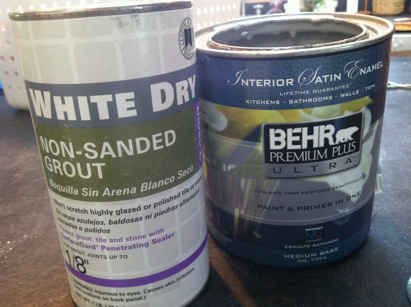
and because of my mosaic hobby, I happened to have unsanded grout, so that's what I used, but you can also use plaster of Paris.

What are the benefits of chalk paint vs. spray or latex, you ask?

1. It goes on with NO primer or sanding. (this is Numero Uno, for me!)
2. Deep, lustrous finish (far nicer than spray paint and less limited in color selection)
3. The chalk makes it self-leveling so there are little to no brushmarks. You can slap-dash this stuff on while sipping soda and singing to Aretha Franklin, no stress about streaks.

Well, sign me up for less stress, right?!


Annie Sloan chalk paint is $35 per QUART. Ouch. That's stressful. I do look forward to buying it, event  (the red looks amazing!) but until then, this is a great substitute. My picture shows a Behr "oops" paint I had in gray...for $2, using an oops paint is an inexpensive way to make sure you like this type of paint.


Like I do with all recipes, I got the basic instructions, then improvised. Basically you want about 2 Tablespoons of grout to 1 cup of paint, then add enough water to mix easily. If you mix the grout and water FIRST, then add to the paint, its not as clumpy.

and here's a tip:
If you don't want to get out the dropcloth for a small project like this, cut down one side of a garbage bag for a disposable "mini-tarp" to paint on.

 
For this table I used a sample pot of my very favorite Benjamin Moore (under $4 at Tommy's Paint Pot, if you are local...great service!) Also, the BM paint made a much smoother chalk paint then the Behr did.
 
Because you add grout and water, and because the coverage is so good, it goes really far. That little sample pot was enough to do two coats on this table, plus a small mirror.

 
I chose this color based on a lovely dresser I saw on one of my favorite decorating blogs, Milk and Honey Home:
 
It makes me happy-happy-happy, this color! Benjamin Moore deep sea Green #735.
 
It is far more aqua than green, a lovely deep turquoise and similar to Annie Sloan's Provence (though this one is a bit darker) according to a friend who has used the original.


I hope you try it, and let me know how it works for you. I'm experimenting with various colors and finishes and will post results on the blog, too!


Thursday, April 25, 2013

Bathroom Vanity re-Design for under $60! Staining Oak Cabinets Espresso

 
The Master Bedroom and Bath are often the last rooms to be remodeled because they are not seen. And often, by the time you've renovated the public areas of the home there isn't much money left to tackle the private spaces! We've lived in our home for nine years this May, and have remodeled extensively...now we are finally heading towards the BACK of the house, to our room.
 
This is the sink in our master bedroom. It's a built in, so not easily (or cheaply!) replaced. Being short on funds is a gift, for it is such a boost to creativity...I hope you are inspired by what a difference 3 twenty dollar bills and some DIY skills can accomplish!
 
BEFORE:
                                  
Dingy gray tile counter top with stained grout.
Oak water-damaged back splash and edge.
Chipped white enamel sink.
20 year old plain Jane faucet on top of a honey oak 1980s cabinet.

The blessing is that the cabinet is solid wood, very sturdy and has plenty of storage. Good bones like that are worth keeping, they just need a little cosmetic update!

                              
                                                            AFTER:
A dark and modern vanity with a vitreous white china sink, creamy laminate counter top, solid tumbled stone back splash plus a Kohler single handle faucet.

COST BREAKDOWN:
General Finishes "Java" gel stain $20
Laminate counter-free (re-used something we had)
new sink $15 (Restore)
Kohler faucet $12 (yard sale)
tumbled stone back splash $4 (Restore)
pre-mixed grout $6 (Home Depot)

I found inspiration for this through Pinterest (I'm on there daily. It's such a treat for a visual person like myself! Feel free to follow my boards, my name on there is MorninGlory!)

I followed a link from there to a blog, which breaks down EXACTLY how to stain a vanity. Wonderful directions here, so I will not bore you by repeating them, just go there if you are interested in doing the same:

http://www.monicawantsit.com/2012/02/staining-oak-cabinets-espresso-color.html

She says "no substitutions! Use THIS BRAND ONLY!"

Sadly, I ignored both the caps and exclamation points because I am a rebel. When I found out I had to special order this stain I was too impatient to wait (which is dumb, you can get it on Amazon in 2 days) and it seemed high in cost. $20 for a little quart? So, I tried to save time and money by using a different stain that Almighty Google assured me was similar...

NO.
 
Instead of a lovely dark java espresso stain? Mucky dark streaks. I madly swiped it off. I tried several coats. I ruined my cabinets, basically. (also smeared it accidentally all over the nearby wall and ended up having to re-paint that, too. ugh.)
 
Now staining my cabinets was no longer a fun option but a dire necessity! I sanded the mess off, logged onto my Amazon account and ordered the correct stuff.
 
Listen, I am all about saving money, but using good materials DOES save money, in the long run. For instance;
I just painted my kitchen. I forked out over fifty bucks for a gallon of Benjamin Moore because I wanted a very specific color and didn't want to risk color matching (posts with photos to come!) That gorgeous paint went on like yogurt, covering a deep mid-tone green with a pale aqua blue in ONE COAT. When I did the living room a few days later, I was kicking myself for not using Benjamin Moore. I had read that Behr's 'Swiss Coffee' was an exact copy of BM's 'Cloud White'. It may be the same color but it is NOT the same quality. It ended up costing the same $$ amount (4 gallons at $25 apiece versus 2 from B. Moore at $50 each) but it cost me TWICE as much time. And as we all know...time IS money.
 
(If you are on a tight budget it is better to get Walmart paint, instead of Home Depots best Behr paint, it's horrid. Truly. It spatters, it barely covers, even the higher end stuff with "added primer". I've painted rentals and kids rooms with Walmart brand (their Antique White is actually a very lovely creamy neutral) and always find it to be a great, though basic, paint. For only $18 or so a gallon it has far better coverage than Valspar or Behr!)
 
 
Lots of sanding later...which is ironic, because the very thing that attracted me to this DIY project was the promise "no sanding!" Learn from my stubbornness...get the right stain and follow directions. The Java gel stain went on thick and beautiful, covering perfectly both the wood I had painstakingly sanded AND the doors that still had poly finish on them.

 
This counter was my nemesis for years. Makeup, toothpaste and grime was continually collecting in these grout lines. I hate tile on counters, because it never feels CLEAN, no matter how you scrub. Tile floors are cold and if you drop a dish, it shatters. Tile showers are a daily chore to keep mildew-free and eventually they leak. Where will I willingly put tile, you ask?
An entryway. In front of a fireplace. As a backsplash. And that's it!
 
You see those "back splash" strips of oak? Pried them off with my favorite tool...
 
 
a butter knife. My husband doesn't understand. He tries to tell me it's only purpose is spreading condiments. However, us creative types see things differently. It's a Flathead screwdriver and also a crow bar that pries almost anything off! Except, apparently, ugly tile.
Then it snaps in half.
 

This is the new laminate counter...much easier to clean! It was a counter remnant, bought a few years ago at Lowe's and used for a desk top.  My sweet husband cut it to fit the space.

I'm not allowed to use the table saw since I cannot handle even utensils correctly.


The lovely Kohler faucet is a bargain that I picked up at a yard sale and tucked away, hoping to do the bathroom "soon". It sat patiently in the garage for years, waiting for that elusive "someday" to arrive. If you see a quality item, jump on it. Maybe the renovations won't be completed as quickly as you hope, but when the time DOES come, your expenses will be far less because of those bargains you stashed away. Craigslist has a great category under 'For Sale' called 'Materials'. I scan it weekly for great deals on tile, windows, lighting, stone and more. If you know you'll be eventually updating parts of your home, it's worth looking early!


Another great source for bargains is your local ReStore. It is a thrift store that supports Habitat for Humanity (If you live local, it's on Oak Patch off of West 11th Ave) and it is full of both new and used materials. People who are renovating donate their materials when they update
(A treasure hunt if you are looking for mid-century lighting fixtures for your atomic ranch, or glass doorknobs for your Victorian cottage!)

and new stores donate extra stock for tax write-offs, too. High quality and new-but dented items are often there, though in smaller quantities. I found the tumbled stone tile (above) for under $5, despite being brand new. There were only a few sheets, but for small projects like a bathroom this is to your advantage!


To sum up, here is my advice for renovating even when you are on a TEENSY budget:

--Keep your color scheme neutral and materials basic. Focus on simply improving the basic functions of your current space rather than on creating new, custom or glamorous remodels. Laminate may not be my number one choice, but compared to dingy gray tile? It's an upgrade! Progress, not perfection is the rule when you are on a tight budget. (Actually, it's a great rule for anyone, am I right?)

--Know when to skimp and when to splurge. Materials matter! And if an expert insists on a certain gel-stain? Don't be impatient or rebellious. Unless it involves cutlery, then go for it.

--Shop beyond the Home Depot and the fancy Tile Store. Scour yard sales, Craigslist and thrift shops for the materials you need, and store them until you are ready to begin.

--If you don't know how to do something? YouTube has videos that will teach you almost ANYTHING. I had never installed a tile back splash before but was driven to desperate by my desire to get rid of those nasty oak strips. Bonus-when your project is complete you have more than just a lovely home improvement. You've added a new skill to your repertoire!

--Focus on the blessings. I would love double sinks but realize that having one is a gift. I only have to share with my husband, and not my three teenage sons! I'd like solid surface countertops, and I'd love to frame the mirror but if neither ever happen, that's okay. We honor God by being good stewards of the time and money He's given, and by being content with what He's given!

Grateful for my new vanity and hoping it inspires YOU!